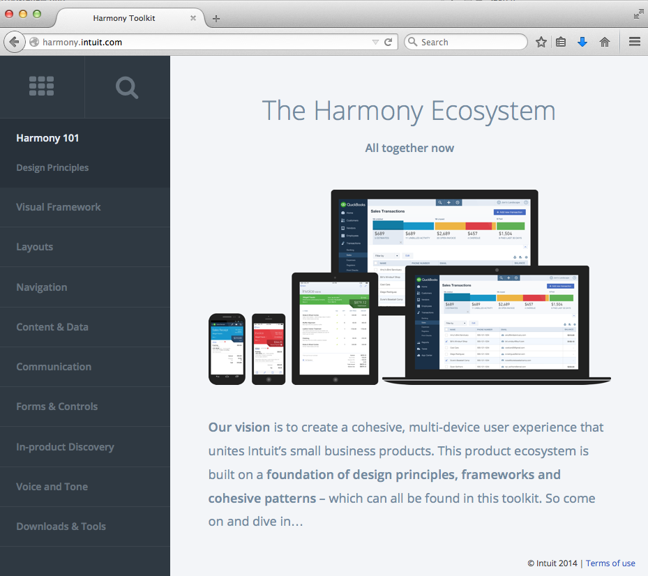
We’re pleased to introduce the Harmony Toolkit (http://harmony.intuit.com) which is where we house our Harmony Design System resources — what we use to design the QuickBooks Online product ecosystem. The Toolkit is a living document that is continually updated as we iterate on our products.
We’re looking forward to talking with you in detail about the Harmony Design System next week Tuesday, January 13, during Intuit Developer’s monthly webinar. In the meantime, here’s a primer on what it’s all about and how it can benefit you, your app, and your customers.
You might be wondering what a design system is, and why we call ours harmony. Well, design systems are typically made up of principles, style guides, interaction patterns — elements to create cohesion and delight. You experience design systems every day: for instance, when you use an Apple device it feels just like every other Apple device because Apple has their human interface guidelines, their design system. Similarly, Google’s design system for Android is called Material design. And so on.
Ours is called harmony because building the QuickBooks ecosystem is all about creating a harmonious experience for our customers, across all their apps and devices. It’s because of our design system that our ecosystem of products can share a common look, feel, behavior, and data across platforms and devices.
We’ve been using the toolkit for over a year internally, and now we’ve opened it up to you, because we believe that partnering with folks who develop apps that work in the ecosystem is essential to build this awesome, harmonious experience that our customers love.
So what’s in the Toolkit and how can you use it? Well, it was originally a tool for designers, so it’s not a code library. What it does have is guidance for making product design decisions: design principles, visual styles, patterns and psd downloads for web, iOS, and Android.
Our Design principles are used as criteria for making decisions. They ladder up to our business goals and vision and help us communicate and speak the same language. You can use these to help decide what elements you should emphasize, and how to guide your users through their tasks.
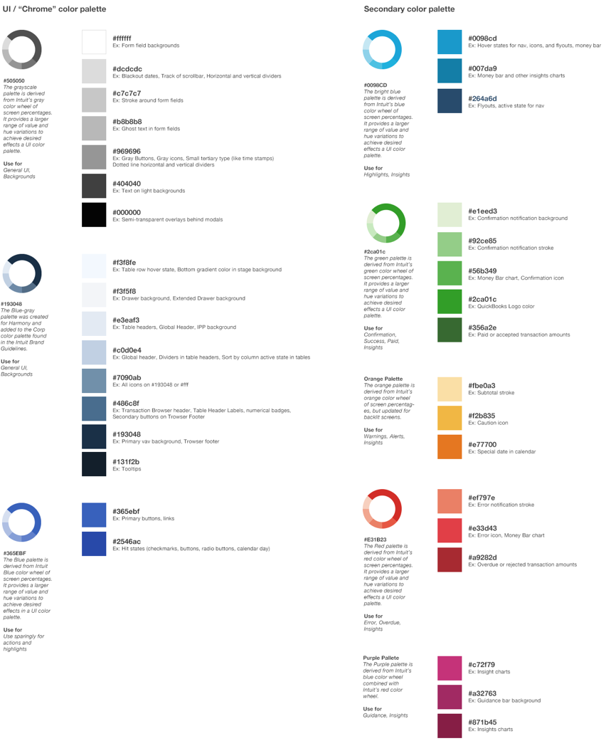
The Toolkit also provides a lot of guidance on the visual system: our colors, typography, icons, etc. Our color palettes have hex values and also guidance on what colors work best together. You can see how we use type: what size our headers are, how to space text, what fonts we use for numbers, and how we handle them on mobile.
The patterns are the real meat of the toolkit. Patterns are the basic building blocks of design, and ours outline both interaction and visual design: how it works and looks and when to use and why. Patterns help create relationships across devices, so that navigation will work as expected from screen to screen or screen to app. Our patterns also contain red-line specs and links to related patterns. Don’t worry if you don’t know where to look, because search also works.
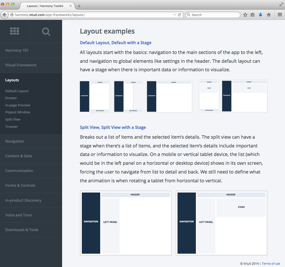
To start using the Toolkit, I suggest starting with our Layouts pattern.
Layouts displays all of the different content containers, and the different ways we put them together. This can help you determine how to best layout your screens. Many patterns, like buttons, help you decide which element works best in each situation. The guidelines in each pattern help as you figure out important tasks and content. Finally, check out the Downloads & Tools section, where we have layered .psd files of all our common elements. Use these to mock up your screens and make quick prototypes.
We hope the toolkit gives you valuable insight into how to build with us, and help us all create a cohesive operating system! Let us know what you think of it in the comments section below, and join our webinar next week to learn more.
Best,
Dorelle Rabinowitz
Intuit Experience Design


Leave a Reply